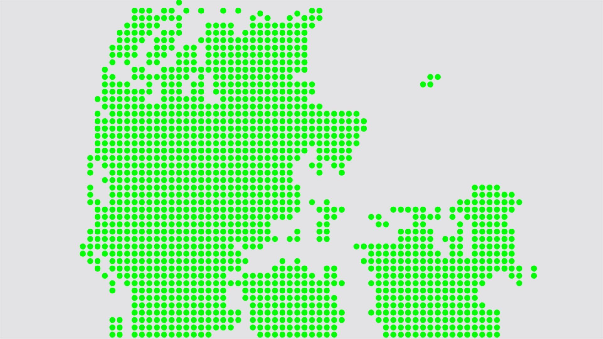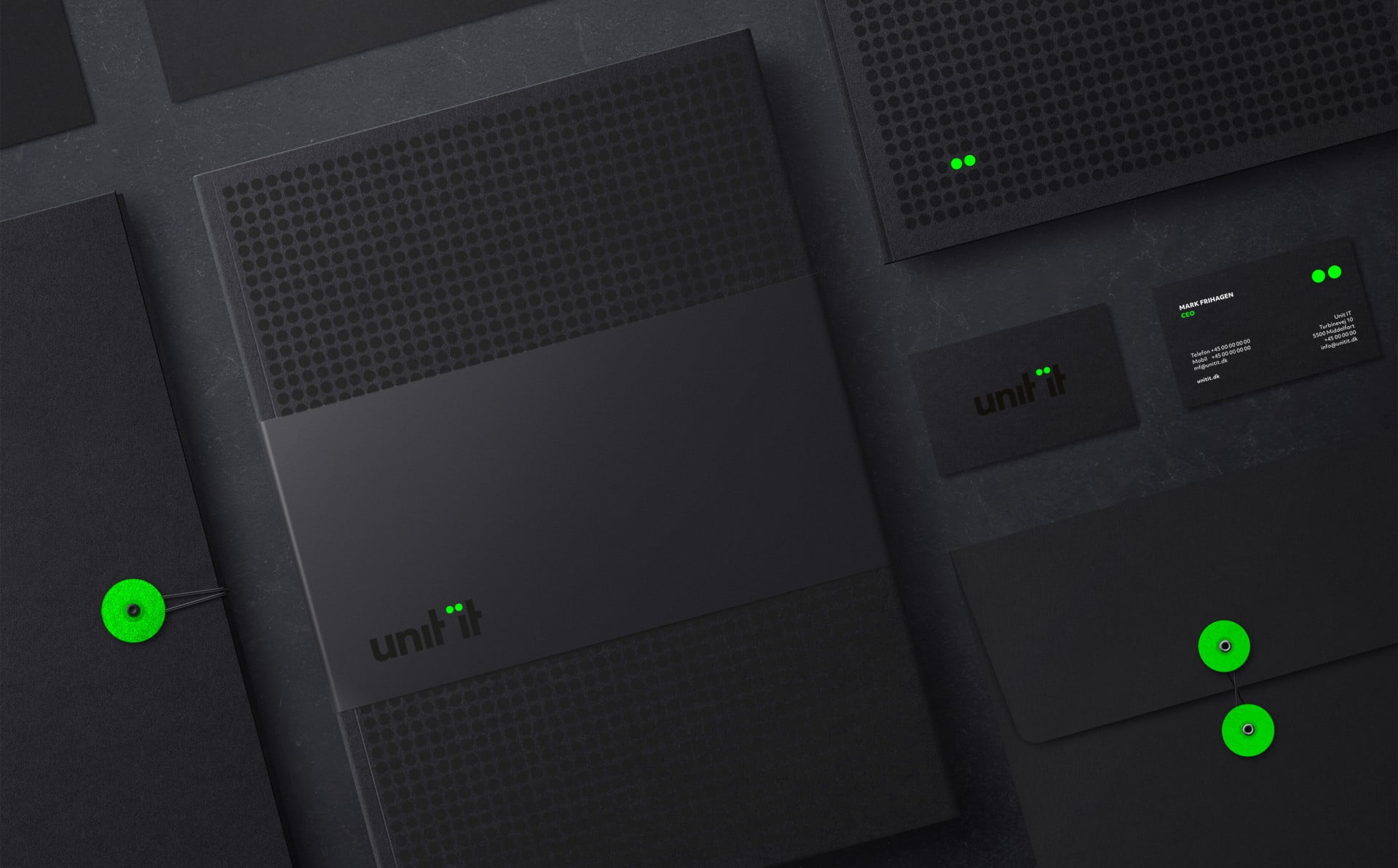
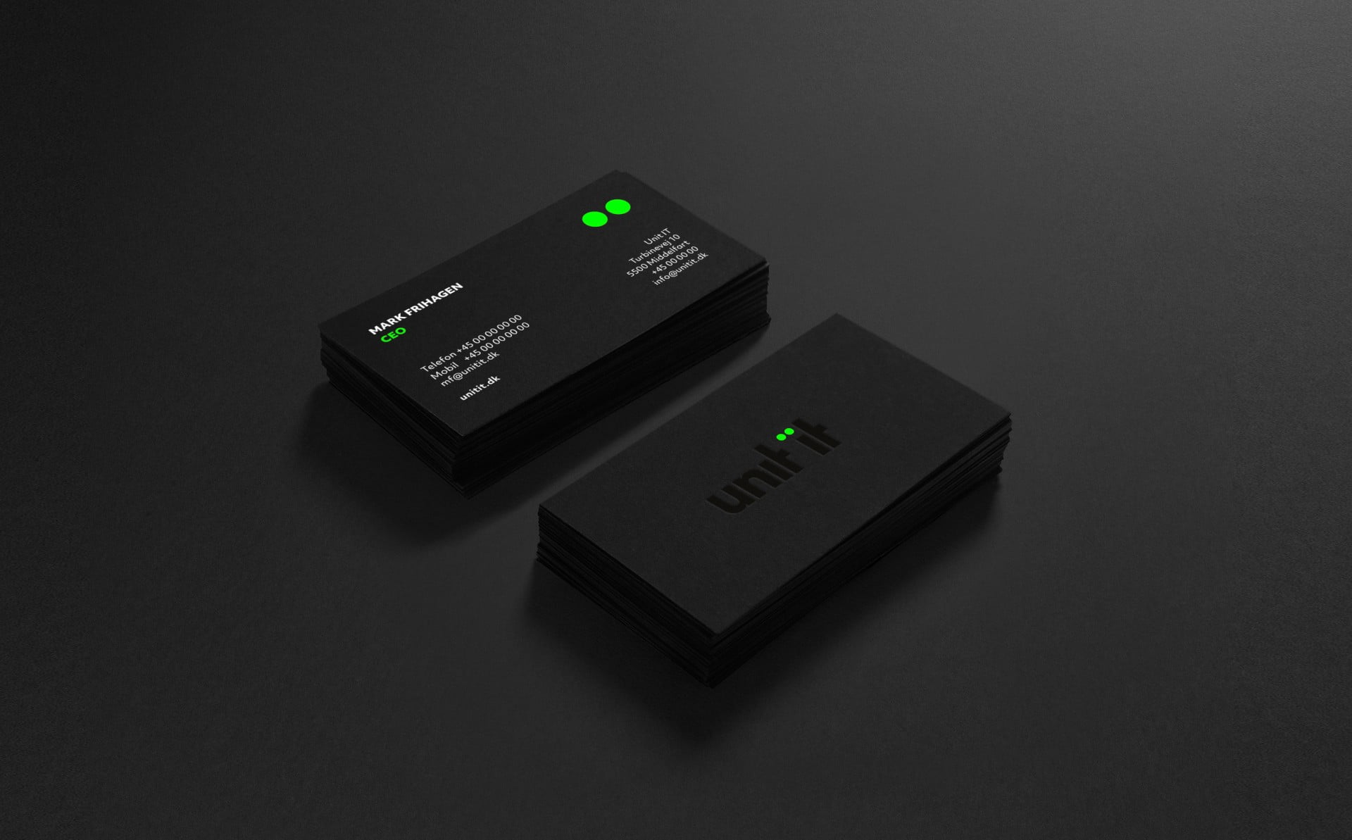
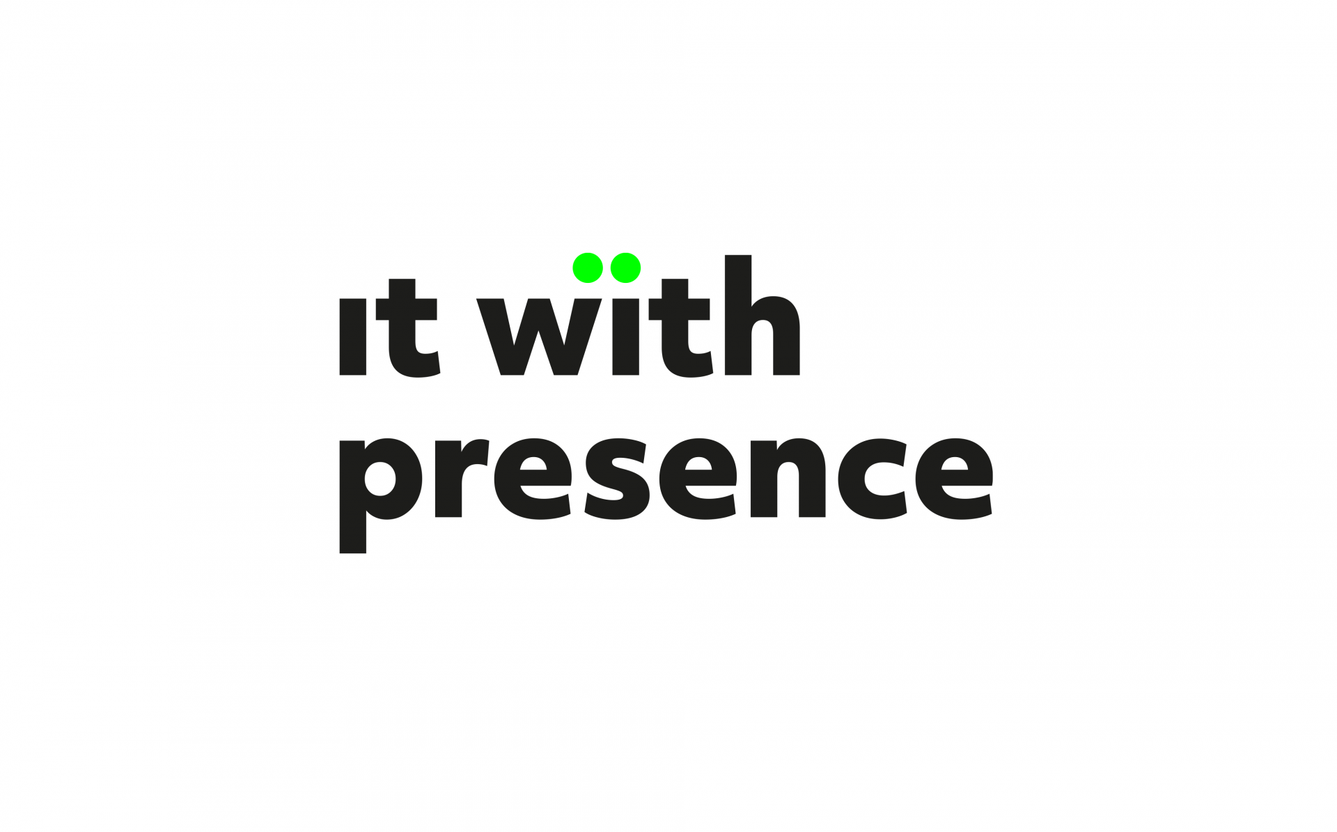
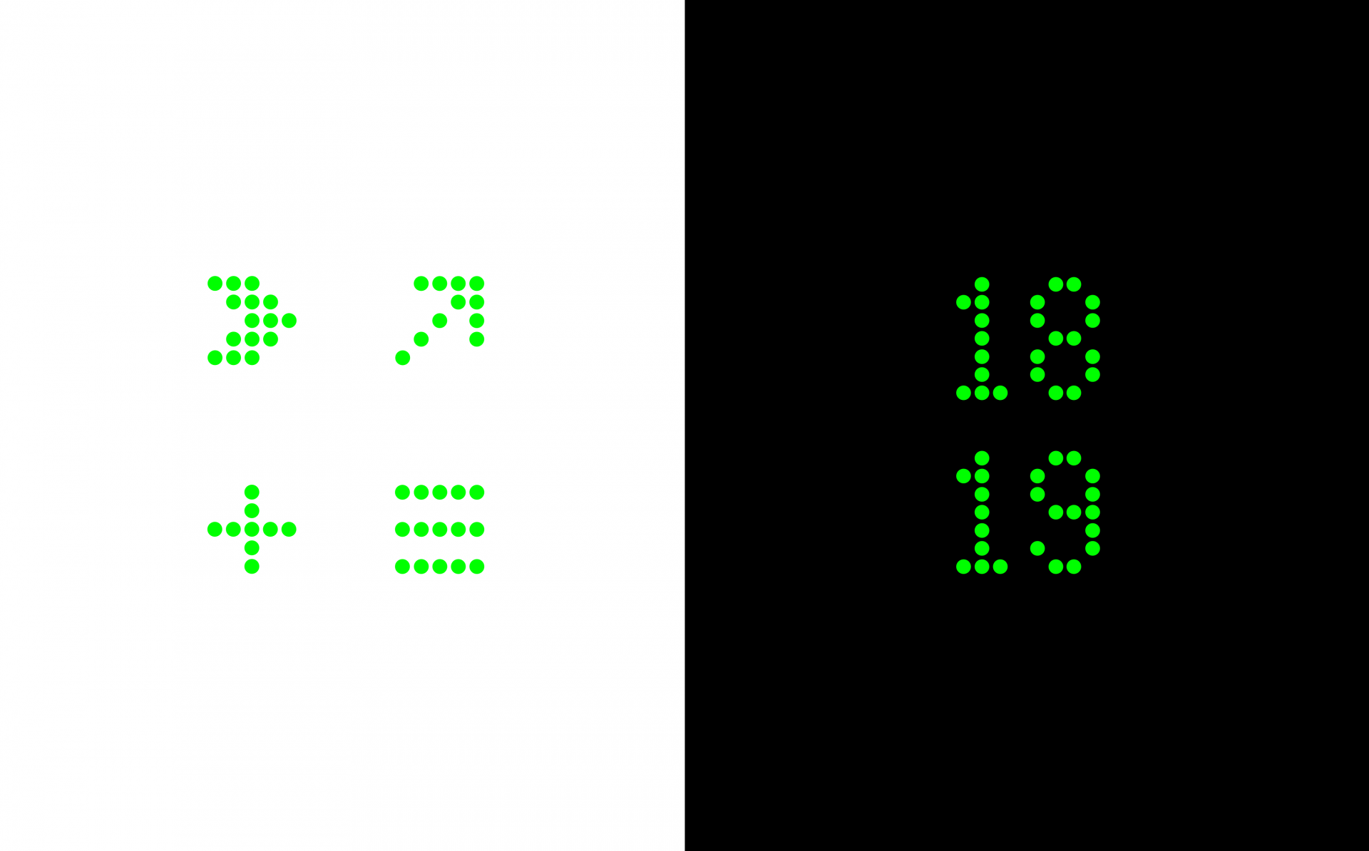
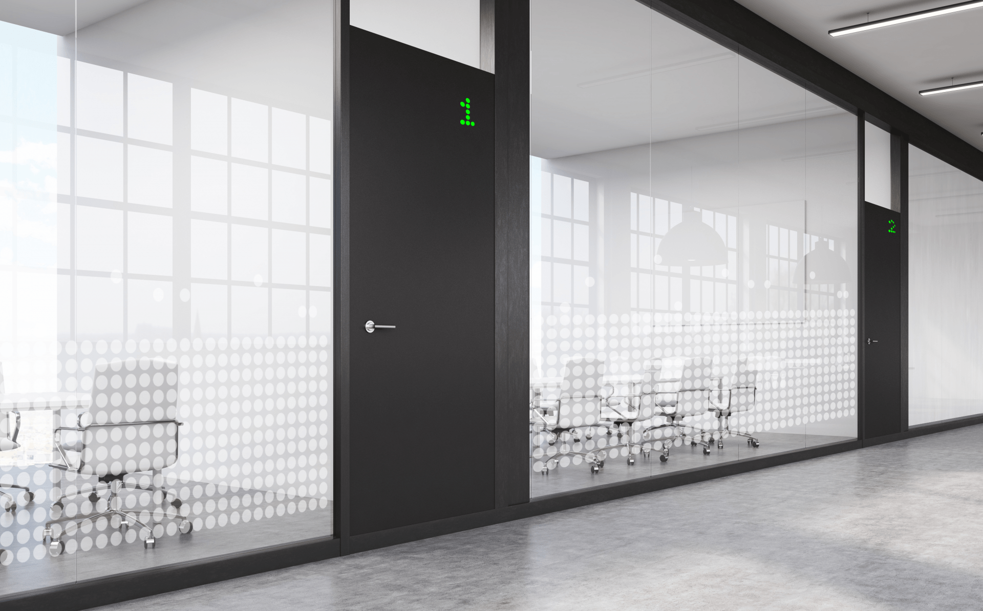
Design and copy elegantly unite through a distinct dot design where ‘data server diodes’ are constantly drawn together to reflect the company’s strong focus on close client relationships.
Services
Target group insights Brand positioning Corporate naming Core brand story Visual identity Key brand messaging Employer branding Motion graphics Brand movie — Red Dot Design Award 2019 Corporate Design & IdentityThe challenge
When the three IT companies, Outforce, MindZet and it-Craft, joined forces, it created the need for a new and unifying corporate identity. The new CVI should reflect the power of a national IT supplier — without compromising on the ability to stay present with local clients.
The solution
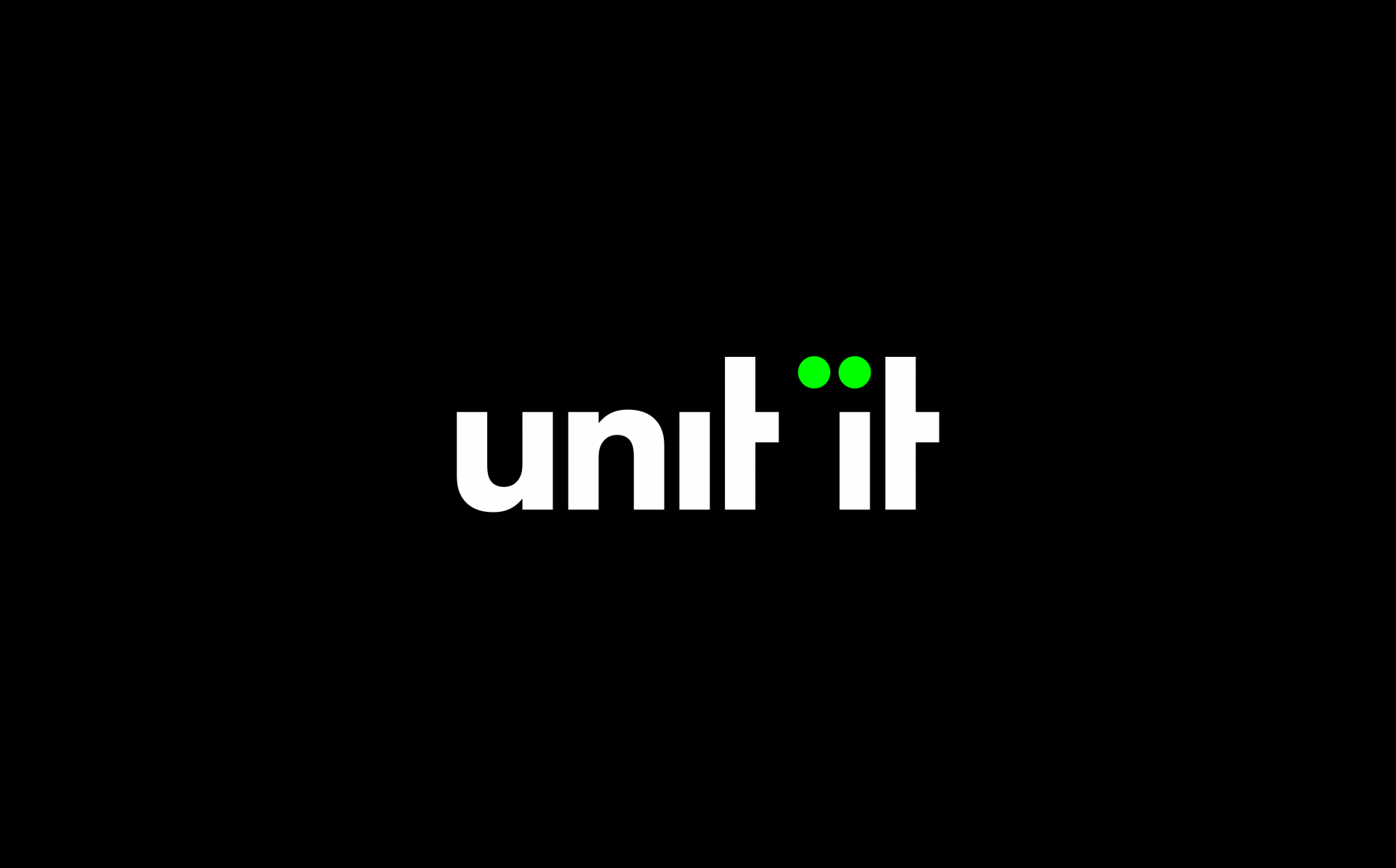
‘Presence’ is the focal point in a visual identity where neon green diodes in the typography are constantly drawn together across key messaging to support the brand promise: ‘IT with presence’. The sense of togetherness and unity (internally and externally) is further stressed in the new brand name ‘Unit IT’ with a subtle reference to the word ‘United’.
The work was awarded a Red Dot Design Award in the category ‘Corporate Design & Identity’.



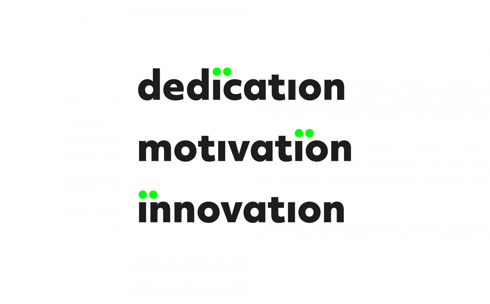

Karim Frølund Jarrar“I’m particularly excited by the way the two dots make design and messaging become one and form this super simple yet highly distinct identity — with a strong promise that can be conveyed in just one single word.”

